Friday 18 February 2011

How to use another control in UI as part of a control’s binding?

Lets say that you want to bind data based on one UI control, how would we go about doing it? I attempted one solution. First lets see how the output look like

image

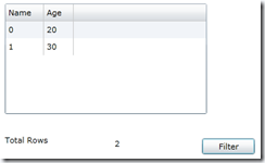
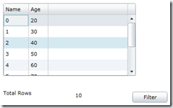
As you can see it has a grid with 10 data items. At the bottom there is a label and text block, the text block shows how many items are in the grid. Also there is a filter button. Every time you press filter button, it will filter all the items in age increment of 20. So if I press filter then the result would be like the following

image

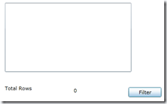
There is not data since the filter will look for age < 20. Now filter again

image

Now there will be 2 items,  where age is less than 40 and so on. The point we are interested in is the Total rows, as the number of rows changes the grid, the number also changes. Lets look the XAML how it is done.

XAML:

 1: <Grid x:Name="LayoutRoot" Background="White">
2: <sdk:DataGrid AutoGenerateColumns="true" Height="156" HorizontalAlignment="Left" Margin="35,24,0,0" Name="dataGrid1" VerticalAlignment="Top" Width="285" />
3: <TextBlock Height="23" HorizontalAlignment="Left" Margin="190,214,0,0" Name="textBlock1" Text="{Binding ElementName=dataGrid1, Path=ItemsSource.Count}" VerticalAlignment="Top" Width="96" />
4: <Button Content="Filter" Height="23" HorizontalAlignment="Left" Margin="313,214,0,0" Name="Button" VerticalAlignment="Top" Width="75" Click="button1_Click" />
5: <sdk:Label Height="28" HorizontalAlignment="Left" Margin="35,209,0,0" Name="label1" Content="Total Rows" VerticalAlignment="Top" Width="133" />
6: </Grid>

The line we are interested in is line (3), look at the Text binding for text block. Here we say, we are want the source of data binding will be the data grid and, I am interested in total count of items source.

Lets look at the code behind on how the data binding happens and how filtering happens.

Code behind:

public partial class MainPage : UserControl
{
PagedCollectionView peopleCollection;
List<Person> people;
private int personNumber=1;

public MainPage()
{
InitializeComponent();
people = new List<Person>();
for(int i=0;i<10;i++)
people.Add(new Person() { Name = i.ToString(), Age = 20 + i * 10 });
peopleCollection = new PagedCollectionView(people);
dataGrid1.ItemsSource = peopleCollection;
}

private void button1_Click(object sender, RoutedEventArgs e)
{
peopleCollection.Filter = null;
peopleCollection.Filter = (p => ((Person)p).Age < (personNumber * 20));
personNumber++;
}
}

The code is simple and straight forward. I create a person collection and then converted it to PagedCollectionView and bind it to the grid. When user clicks Filter button, I clear the filter first then apply filter. There is no code in code behind which changes the text block count. It is all done in the XAML with stright control binding.

Monday 14 February 2011

Making two cells in a grid dependable

One of my colleague was trying to create a Silverlight grid, where two columns are dependent. For sake of simplicity, lets say I have two columns, A and B. If A has a value in a valid range then Column B will be editable otherwise it is read only. Even though I said, it is columns, in reality it is cells. The reason I did not make the distinction in the beginning is that, it is taken care by binding. So how do we go about solve this problem. It is actually very easy than what we think. Now that we going to see the example, just want to point one out, I use Component One data gird a lot and I thought, I will bring in component one grid in this example as well.

1. First create a class where we will use this dependency. For simplicity I created a Person class as follows.

public class Person : INotifyPropertyChanged
{
private string _name;
public string Name
{
get
{
return _name;
}
set
{
_name = value;
RaisePropertyChanged("Name");
}
}

private double _amount;
private int _bonus;

public double Amount
{
get
{
return _amount;
}
set
{
_amount = value;
RaisePropertyChanged("Amount");
}
}

public int Bonus
{
get
{
return _bonus;
}
set
{
_bonus = value;
RaisePropertyChanged("Bonus");
}
}

public void RaisePropertyChanged(string propertyName)
{
if (PropertyChanged != null)
{
PropertyChanged(this, new PropertyChangedEventArgs(propertyName));
}
}

public event PropertyChangedEventHandler PropertyChanged;
}

In the above class, the two fields that we are interested in are Amount and Bonus. When the amount is more than 1000 then bonus field will become editable.

2. Create XAML to bind the collection as follows

 1:     <Grid x:Name="LayoutRoot" Background="White">
2: <Grid.Resources>
3: <converter:ColorConverterForReadOnly x:Key="converter1"/>
4: <converter:ReadOnlyConverter x:Key="converter2"/>
5: </Grid.Resources>
6: <c1:C1FlexGridExcel Name="_flex" AutoGenerateColumns="False" HorizontalAlignment="Stretch" VerticalAlignment="Stretch">
7: <c1:C1FlexGridExcel.Columns>
8: <c1:Column Binding="{Binding Name}"/>
9: <c1:Column Binding="{Binding Age}"/>
10: <c1:Column Binding="{Binding Amount, Mode=TwoWay}"/>
11: <c1:Column Binding="{Binding Bonus, Mode=TwoWay}" HorizontalAlignment="Right">
12: <c1:Column.CellTemplate>
13: <DataTemplate>
14: <Grid>
15: <Border Background="{Binding Amount, Converter={StaticResource converter1}}"/>
16: <TextBlock Text="{Binding Bonus}" VerticalAlignment="Center" HorizontalAlignment="Right"/>
17: </Grid>
18: </DataTemplate>
19: </c1:Column.CellTemplate>
20: <c1:Column.CellEditingTemplate>
21: <DataTemplate>
22: <Grid>
23: <Border Background="{Binding Amount, Converter={StaticResource converter1}}"/>
24: <TextBox IsReadOnly="{Binding Amount, Converter={StaticResource converter2}}" Text="{Binding Bonus, Mode=TwoWay}"
25: Background="{Binding Amount, Converter={StaticResource converter1}}" HorizontalAlignment="Right" VerticalAlignment="Center" Margin="0"/>
26: </Grid>
27: </DataTemplate>
28: </c1:Column.CellEditingTemplate>
29: </c1:Column>
30: </c1:C1FlexGridExcel.Columns>
31: </c1:C1FlexGridExcel>
32: </Grid>

In the above code,you will notice I am using two converters. First converter will set the back ground color to readonly background color when the amount is less than 1000. The second converter will return true or false based on amount field.

So if you would notice, from line 12 – 28, have two definitions. one for cell template to render the data and cell edit template which will be used when user try to edit the cell.

In cell template, line 15, will set the back ground of the cell to read only look based on the amount. As you can see, Background is bound to amount but the brush will be set in the converter. (will see the converter later).

Line 16 basically shows a text block which by default readonly to show the data.

Line 23 is same as line 15 to change the background color.

Line 24 is a text box which will allow the user to edit the cell if the amount is greater than 1000. This is achived by IsReadOnly property, which is bound to Amount again, when it is passed through the converter, it will check and see if the amount is greater than 1000 and based on the value, it will return true or false. So if the amount is less than 1000 then isreadonly will be true thus making the cell readonly.

3. The Converters:

 1: public class ColorConverter : IValueConverter
2: {
3: public object Convert(object value, Type targetType, object parameter, System.Globalization.CultureInfo culture)
4: {
5: double? data = value as double?;
6:   7: if (data == null || data < 1000)
8: {
9: return new SolidColorBrush(Color.FromArgb(255, 200, 200, 200));
10: }
11: else
12: return null;
13: }
14:   15: public object ConvertBack(object value, Type targetType, object parameter, System.Globalization.CultureInfo culture)
16: {
17: return null;
18: }
19: }
20:   21: public class ReadOnlyConverter : IValueConverter
22: {
23: public object Convert(object value, Type targetType, object parameter, System.Globalization.CultureInfo culture)
24: {
25: double? data = value as double?;
26:   27: return (data == null || data < 1000);
28: }
29:   30: public object ConvertBack(object value, Type targetType, object parameter, System.Globalization.CultureInfo culture)
31: {
32: return value;
33: }
34: }

The first converter is background color converter called ColorConverter. Which is used in the background property binding. As you can see in line 7, when the amount is less than 1000, then it returns gray background brush. Other wise, it returns null.

The second converter (line 21) is read only converter. This will return true, when the amount is less than 1000 otherwise is false at line 27.
Sunday 13 February 2011

How to Connect to Team Foundation Server Using C#

In this article I will show you how to connect to Team Foundation Server and add work item via code
First thing you must install TFS SDK, you can download the Team Foundation Server SDK from the below link.
http://www.microsoft.com/downloads/details.aspx?FamilyID=7e0fdd66-698a-4e6a-b373-bd0642847ab7&DisplayLang=en

Steps:
1- Create windows or web Application
2- Add References for :
Microsoft.TeamFoundation.Client
Microsoft.TeamFoundation.WorkItemTracking.Client
3- The below code will help you to work with Team Foundation Server

using Microsoft.TeamFoundation.Client;
using Microsoft.TeamFoundation.WorkItemTracking.Client;

// declaration variable
private NetworkCredential networkCredential = new NetworkCredential("enter here User Name", "enter here password", "enter here domian");
private Uri uri = new Uri("enter here TFS URL");
string projectName="enter here TFS prject name";
string worktemType = "enter here Work Item Type";

// Set Authentication To TFS
TeamFoundationServer teamFoundationServer = new TeamFoundationServer(uri.AbsoluteUri, networkCredential);
teamFoundationServer.Authenticate();
//Add Work Item
WorkItemStore wis = (WorkItemStore)teamFoundationServer.GetService(typeof(WorkItemStore));
Project tfsProject = wis.Projects[projectName];
WorkItemType wiType = tfsProject.WorkItemTypes[workItemType];
WorkItem workItem = new WorkItem(wiType);
workItem.Title = "Test Work Item";
workItem.Description = "Work Item Description";
workItem.Save();

Tuesday 1 February 2011

How to order columns while binding to Grid?

One of my silverlight newbie friend asked, when I have a collection of data that I bind to grid and want to autogenerate columns based on the class it is bound to but I want to control the order it appear and also I do not want to display some of the columns. It was funny when he asked me I was stumped since I never did this kind of binding. Well, it is not that difficult. ComponentModel is here to help. So here is how we do it.

1. Create you XAML which which will have nothing but a Grid like the following

   1:  <sdk:DataGrid Name="_normal" AutoGenerateColumns="True" HorizontalAlignment="Stretch" VerticalAlignment="Stretch" Grid.Row="0">
   2:  </sdk:DataGrid>  
2. Create your model. In my case I created a person class. 
public class Person: IDataErrorInfo
{
[StringLength(20)]
[Display(Description="Name", Order=1)]
public string Name { get; set; }

[Range(0, 100)]
[Display(Description="Age", Order=2)]
public int Age { get; set; }

[Display(Description="Address 1", Order=5)]
public string Address1 { get; set; }

[Display(Description = "Address 2", Order = 4)]
public string Address2 { get; set; }

[Display(Description="Amounts", Order=3)]
public double Amount {get; set; }

[Display(AutoGenerateField=false)]
public double DoNotShowThisField {get; set; }

private double doNotShowThisField1;
}

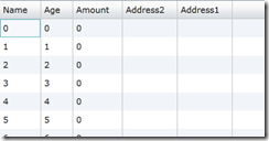
Now you create your data collection and bind it to your gird. Your output would be something like the following

image

The attribute, Display sets the column order to display in the grid. As you can see Amount comes last in the class property but the Display order was set to 3 so it appears at 3rd column. Also notice DoNotShowThisField, even though it is declared as public, the display attribute says, when autogenerate fields for data binding, do not include this field.

Hope this helps.